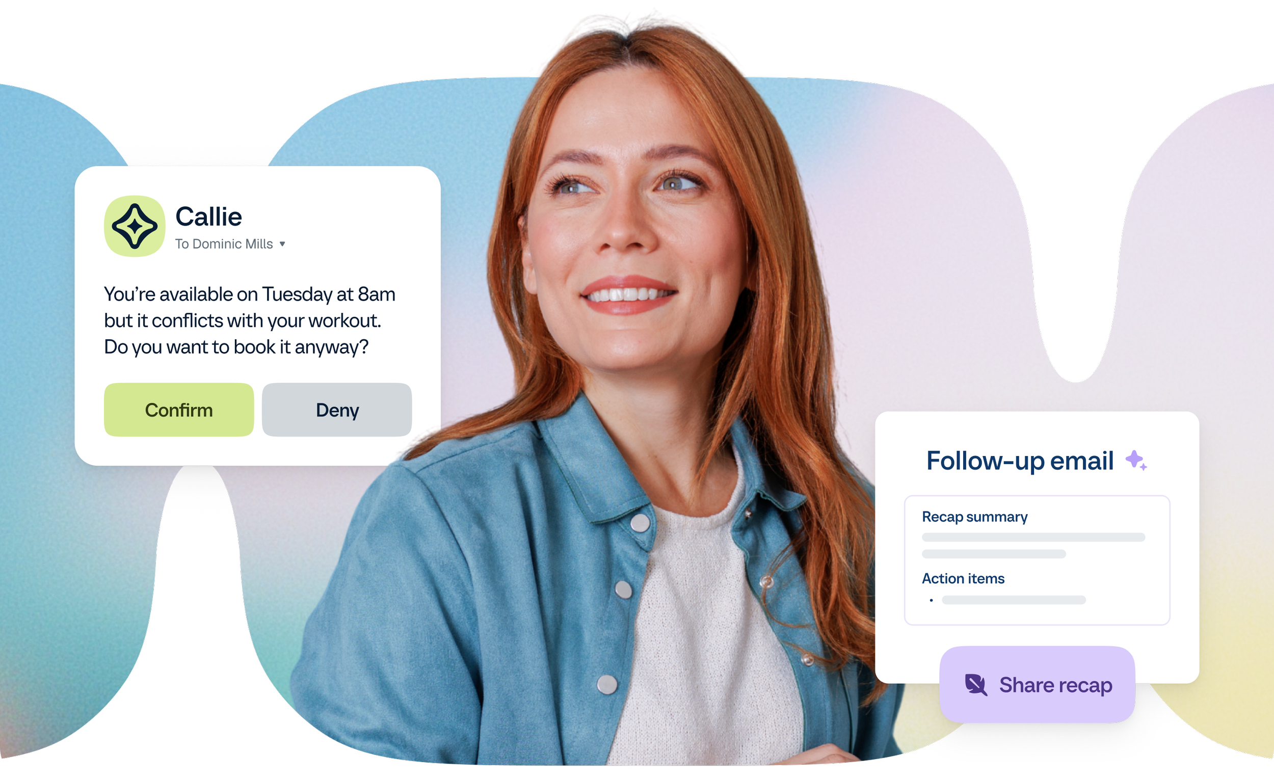
Calendly’s new identity introduced a fresh visual language for the brand. The next step was finding ways to bring it into everyday marketing—from social and email to blog imagery and product storytelling—keeping it recognizable while letting each piece work in its own way.
/01
Calendly Rebrand
(A) Year_ 2026
(B) Credits_ Amanda Norris, Ruthie Greenblatt,
Smith & Diction
Smith & Diction created the new identity, and our in-house team was responsible for carrying it across Calendly’s day-to-day marketing. I contributed to social templates, blog imagery, and other marketing assets, adapting the new visual language to different formats and messages.
I also worked with Ruthie Greenblatt and Amanda Norris on a flexible way to bring Calendly’s product UI into brand storytelling. We explored how interface elements could be simplified and arranged as graphic compositions, keeping the product recognizable while giving marketing visuals more personality. Each application called for a different balance of brand expression and clarity, while staying connected to the larger identity.
(C) Scope_ Figma Component Libraries, Brand UI System, Refreshed Deliverables
/01
My Role
As a Graphic Designer III on Calendly's in-house creative team, I worked alongside Ruthie Greenblatt and Amanda Norris to help extend the new identity beyond the original brand system.
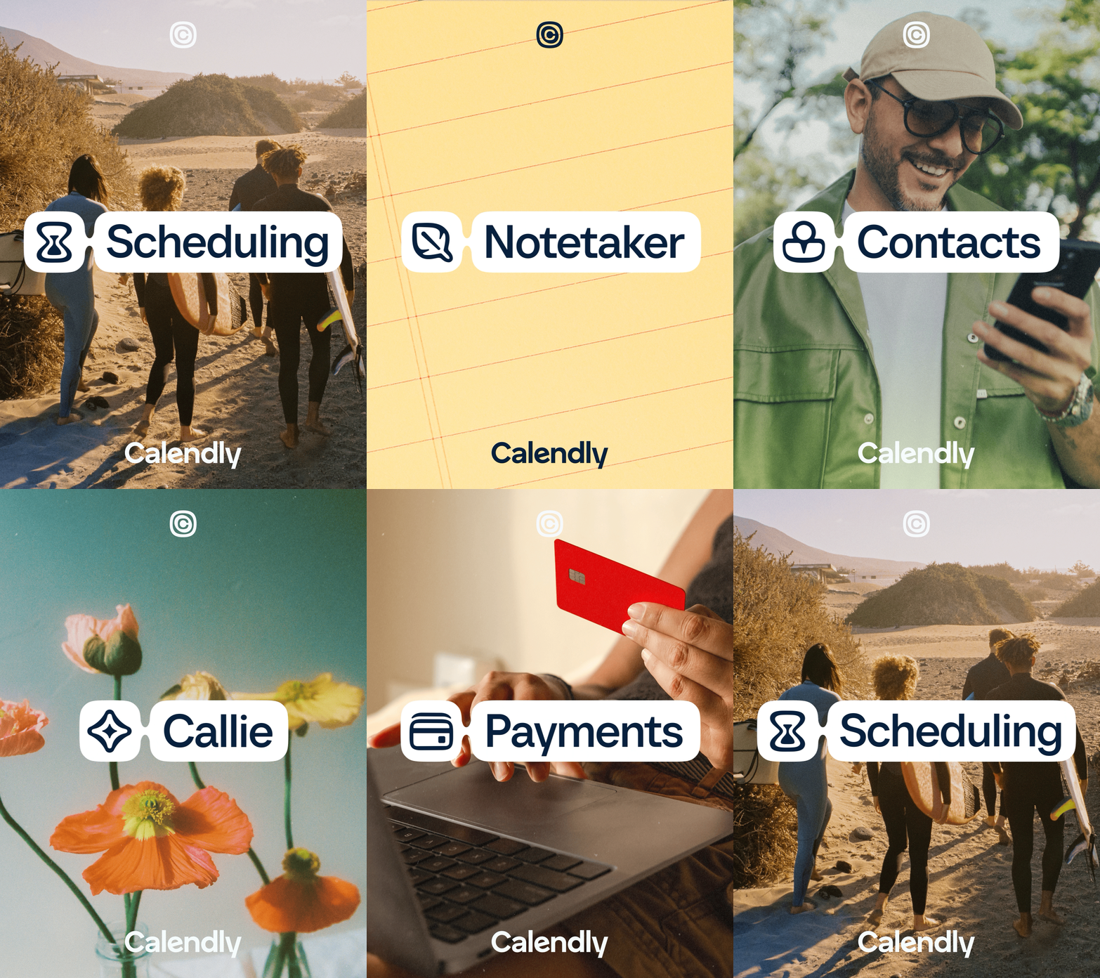
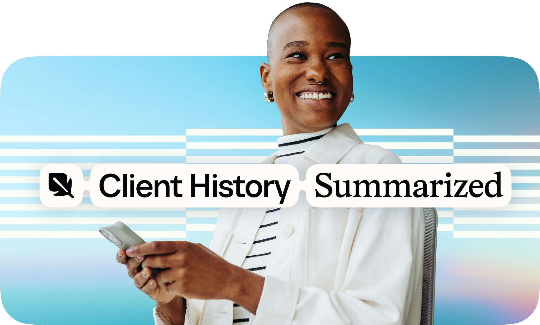
I focused on creating social templates and, with my teammates, developing a new system for abstracting and presenting Calendly's UI in the new visual language. Across the rollout, I also contributed to a range of additional brand touchpoints as we worked to make the new identity feel cohesive in practice.
Blog Refresh
/02
Bringing The Brand Into The Blog
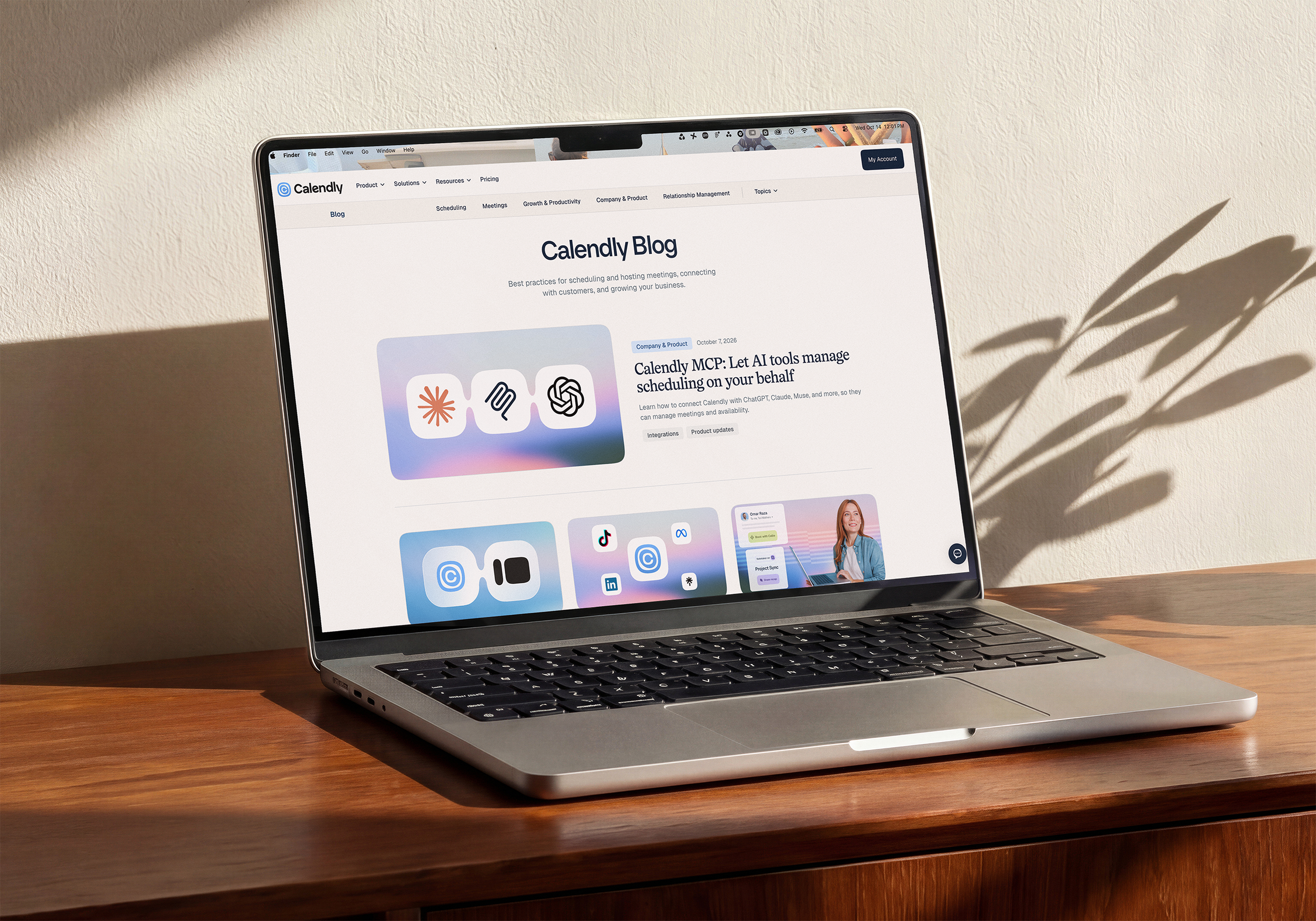
I started by looking at Calendly’s existing blog as a whole, capturing the page and bringing it into Figma to explore how the new imagery would work together in context.
With the refreshed brand’s gradients playing a prominent role, I experimented with a mix of solid-color backgrounds, gradient treatments, and patterns incorporating generative gradient artwork. The goal was to create a cohesive visual rhythm across the blog without making every image feel like the same template.
From there, I updated a range of existing blog images to align with the new identity, giving the editorial experience a fresh look while preserving variety from story to story.
/03
A Flexible Social System
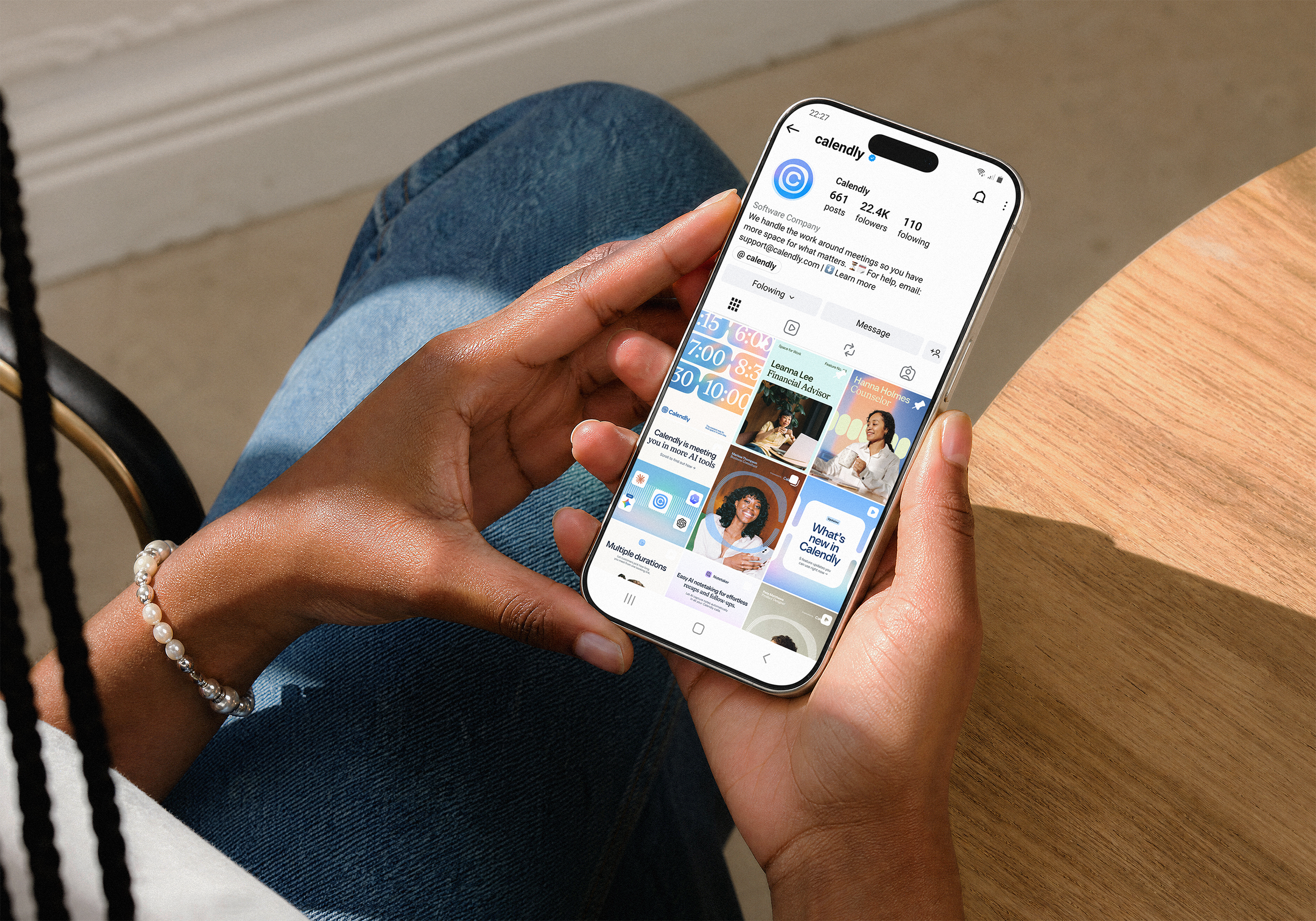
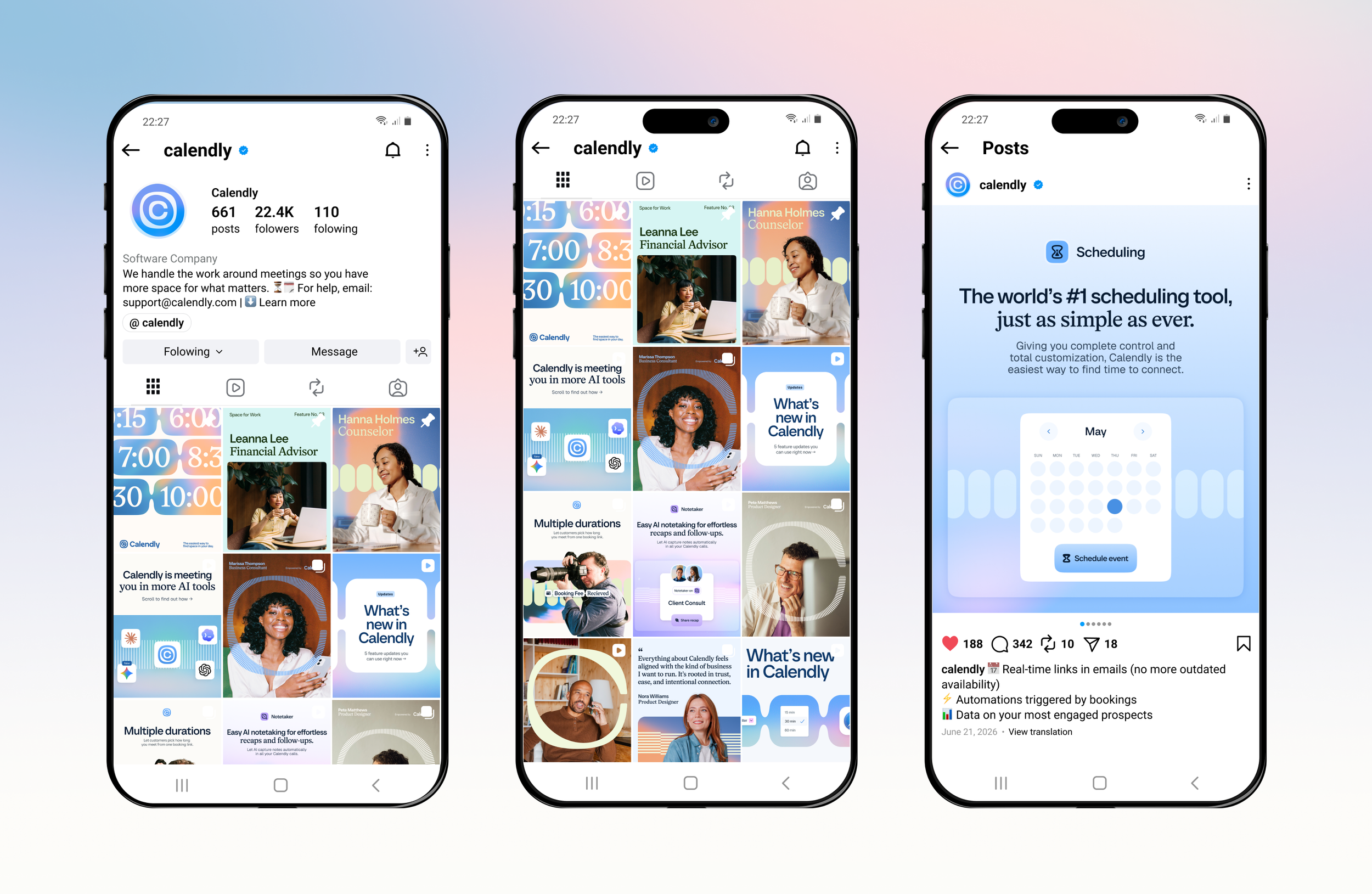
I developed a set of social templates to bring Calendly’s refreshed identity to life across social channels. The goal was to create a cohesive visual language that could adapt to different messages and content types while maintaining the personality of the new brand.
/04
Building A Modular
UI System
Working alongside Amanda Norris and Ruthie Greenblatt, I helped rethink how we created product UI abstractions for Calendly’s marketing materials.
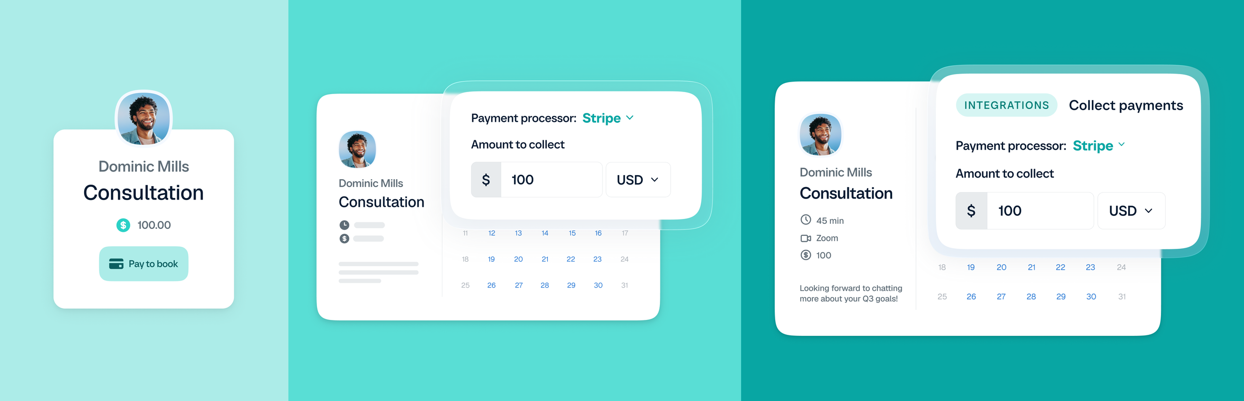
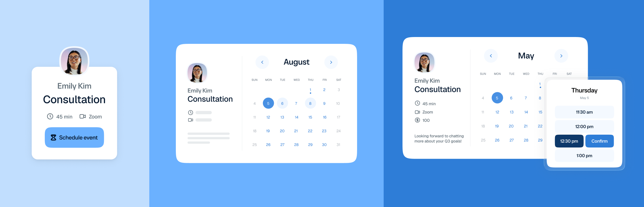
We started by collecting the existing UI abstractions we used most often and breaking them down into their smallest reusable elements. Avatars, names, buttons, date pickers, meeting details, and other interface elements became the building blocks of a new component library in Figma. We called these atoms.
We then used those atoms to rebuild our most frequently used UI abstractions, which we called molecules. Each abstraction could be assembled from reusable components rather than recreated from scratch, making it easier to update existing designs and build new ones in the refreshed brand.
To make the system more versatile, we also developed low-, medium-, and high-fidelity versions of the abstractions, allowing us to choose the appropriate level of detail for different marketing needs.
The result was a more modular, efficient way to create product visuals—one that helped us scale the new brand across marketing materials while keeping the UI consistent.